Chatter
Submitted by Rebekah on Mon, 06/10/2013 - 15:59 Tags:

This time on the blog, I have the unhappy job of saying goodbye to Plum and to the fabulous readers of No Guru. I've been lucky enough to work for this company for two years now, as a sales associate in the stores and as a blogger/social media-type here at the head office (not my exact job title). Along the way I've cultivated relationships with customers both online and offline, and that has easily been the most rewarding part of my job.
It's difficult to say goodbye to something I loved doing, but I'm also looking forward to what comes next. I'm currently completing my master's degree in Library and Information Studies and have accepted a new job in my field. It's not quite fashion blogging, but it'll do ;)
Thank you for reading, thank you for commenting, and I hope you've had as much fun as I have!

... read the full post and reader comments
Submitted by lindsay on Thu, 09/26/2013 - 12:56
 
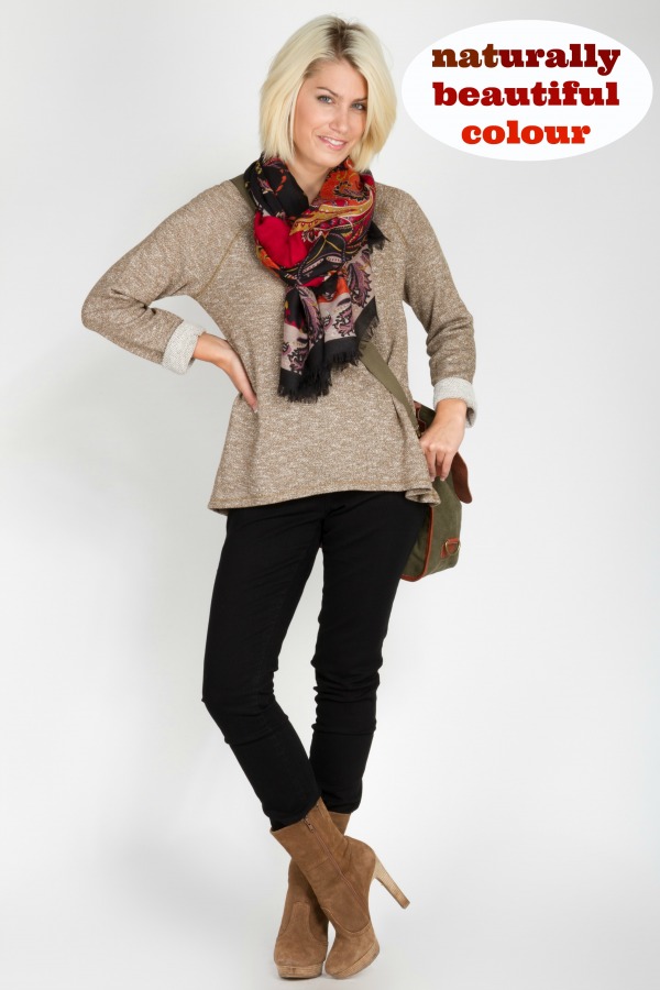
Nature is inspiring--every season it comes out with amazing colour combinations. Whether they're light and bright like in the spring, clear and cool in the winter, or rich and woodsy in the fall, Nature can surprise us with the variety of colours it offers. Just like Nature, we are inspiring and surprising, and our natural colouring can serve as the basis for our colour choices in clothing as well! You don't see Nature running around wearing pale, baked colours in the spring, when everything is fresh and new, and you don't see many riotous colours in the winter, when things are a little more stark and dramatic.

It works the same way for us. When people with really light and bright colouring wear something that is pale and soft, it looks out of place. Same with people who have really gorgeous intense colouring--when they wear something too warm and woodsy, or something that just doesn't pop, they can also look out of step. If you've got something in the closet that you just aren't wearing, colour can be one of the reasons why. Take the item, step in front of a mirror, and see if it really matches who you are. If not, it might be time to shop with purpose and find something that makes you look naturally healthy, radiant, and beautiful. Take a page out of Nature's album and find out what your natural colours can do for you.
UPDATE! Plum's fashion consultants have now completed all 3 modules of the training program: colour, body analysis and personality. We have learned so much and we are eager to share it with you. Stay tuned to No Guru for more posts on body analysis and personality coming soon.
 
Did you catch the 3rd post in our colour series? Click here to catch up! ... read the full post and reader comments
Submitted by lindsay on Wed, 09/18/2013 - 16:35 Tags:
 
In our first post on colour, we talked about five ways that colour is still relevant in dressing. Even though 'Colour me Beautiful' made colour analysis popular in the 1980s, the concept hasn't gone away and has actually developed further over time. From our first understanding of how the science of colour could impact the way we look in our clothing, and from a narrow definition of what constituted the 'right colours,' the systems for analyzing colour have really evolved as years have passed and science has advanced.
What's happened is that we discovered the seasonal dimensions just didn't fit everyone. Four boxes or seasons is a pretty narrow definition for a lot of women. We wanted to know how to find colours that worked without being restricted to a swatch wallet of colour. As a result, colour analysts and image professionals have been shifting to using more of the dimensions of colour instead of seasons to define how colour works.

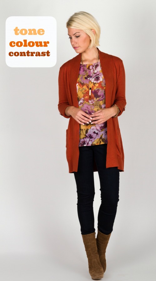
There are three dimensions we look at, including tone, colour, and contrast. What this means is that someone who has a pinkish skin tone will match better with cooler, blue-based colours. Someone who has light, bright colouring will look better in lighter, brighter colours (also known as 'high value' colours). Someone who has very soft colouring, not too intense, will match a softer palette, since really bright hues will overwhelm their delicate colouring. Instead of classifying someone with dark hair and dark eyes as a Winter, we might instead say that they have a cool undertone, can wear both high and low value colours (light and dark) and need intense colours to go with their more intense colouring.
This evolution of colour analysis allows us to have a greater range of colour selection over time and helps us navigate the colour trends year after year. It can also help retailers like us to choose things that suit different colouring, instead of just going with what's trendy. This is one way that we're helping customers dress with purpose!


Did you miss part 2 in our colour series? Click here to catch up!
... read the full post and reader comments
Submitted by lindsay on Fri, 09/13/2013 - 08:59 Tags:
 
We think that the world is shifting; we've noticed a new spin on beauty and are loving the direction the conversation is taking in social media and other arenas. The idea that the new beauty is about being healthy, natural, fully self-expressed and joyful is one we embrace here at Plum. We love the idea that every woman is uniquely fabulous and we're learning new ways to help our customers 'dress with purpose.'
Colour is just one of the ways we're helping our customers find a look that suits who they are. In our last post on colour, we laid out five ways that it is still hugely relevant in dressing. One of the reasons for this is that it's tough to argue with science. Biologically, when we're looking at colour, we're responding to input from light reflecting off a fabric, onto the skin of the wearer and noticing what kind of impression that leaves. When a colour works well for someone, we might notice that they look healthier, well-rested, and glowing, no additional makeup, buffing, or tanning required!
How does that work? It means working with your natural colouring and choosing to wear colours that match you. For example, if your skin has a rosy glow, you might look better in cool, soft colours. If your colouring is intense, you probably look great in really bright colours. What does this type of matching do for you? It creates a sense of harmony in your impression, meaning that people will feel comfortable with you right away, even if they don't know why. In all our relationships, this can be very beneficial, from securing that great new job or plum assignment to getting that second date!
If a colour isn't working well, we might notice that a person looks tired or worn out. All of the great things you do for the health of your body such as exercising, eating well, and getting plenty of sleep can be undone in seconds by choosing to wear a colour that doesn't suit you. Even though we might stick to the old habit of wearing the colours that worked for us in years past, and were bombarded with the narrow idea of what beauty meant, this new direction of a healthy, natural look means that we have more liberty than ever to wear what works for us. Not only that, but once we understand the dimensions of colour and can see how wearing the right colours for us helps us look great, we can use that knowledge to shop more efficiently and with purpose.

Did you miss part 1 in our colour series? Click here to catch up!
... read the full post and reader comments
Submitted by Rebekah on Tue, 02/26/2013 - 17:15

On March 7, Dress for Success Vancouver is hosting its annual fundraising event at the beautiful Rosewood Georgia Hotel. Dress for Success is an organization that provides women with the clothing (not to mention confidence!) they need to succeed in the workforce. If you enjoy hors d'oeuvres, door prizes, live auctions, and listening to the remarkable success stories of women aided by Dress for Success, I would strongly urge you to consider attending. You can find all the details, as well as a link to purchase your tickets, here:
Impact - An Event for Change
... read the full post and reader comments
Submitted by Rebekah on Wed, 11/07/2012 - 12:32

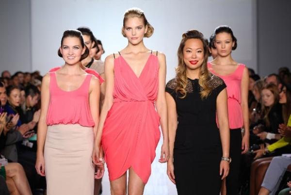
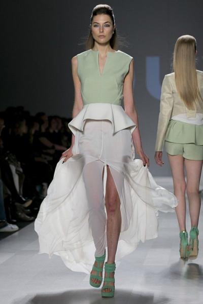
Designer Rachel Sin - Image Courtesy of World MasterCard Fashion Week
I will admit, it’s hard not to get excited about the styles we’ve been seeing for Spring 2013 on the runways in New York, Paris, and Milan. But here at Plum, we’re more interested in what our fellow Canadian designers are up to. So, we collaborated with a local blogger to have her cover the recent Toronto Fashion Week for us!
Five days of shows later and she assures us it was a “great display of Canadian talent.” One of the standout shows of the week was a presentation by Canadian architect turned designer (/coolest woman ever), Rachel Sin. Raj Thandhi, our eyes and ears on the scene, gave us a rundown on what made her presentation so exceptional.
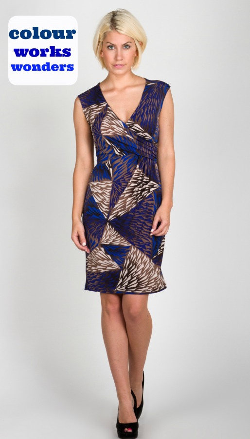
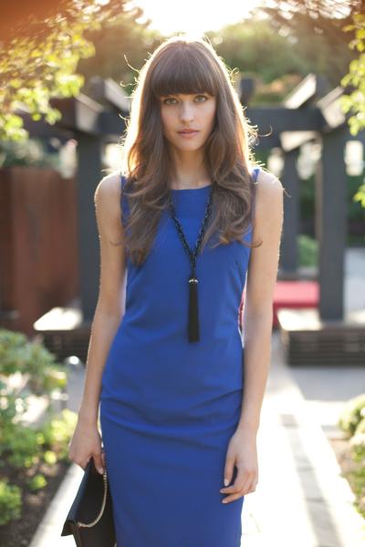
“These pieces were very wearable by everyday women and she had looks that would take you from the office to date night with just a few accessories. One of the only designers to show clean silhouettes in bold colours, she incorporated coral, blue, beige, and black into her line. In fact, when Rachel’s cobalt dresses were coming down the runway, I kept thinking of this blue sheath designed by our own Claudia Agusti and currently available in store.”
Toronto Fashion Week featured several Vancouver designers as well, including a home-grown North Van woman, Patty Nayal of Pure Magnolia bridal. Her unique and sustainably-made gowns are an absolute must-see. Seeing talent like hers makes us even prouder to be designing in the Vancouver fashion scene!
Raj also attended Toronto’s 2012 Design Start-up Competition. She describes it as an initiative that:
“provides a national platform to discover and support emerging Canadian designers that have been in business for less than five years. Winners of the competition receive mentorship from industry professionals, exposure, and much needed funding. To find these talented designers and to ensure a nationwide effort, searches were held in Edmonton, Halifax, Quebec City, and Ottawa. Each designer had to show a mini-collection, present a business plan, and pitch to a panel of experts before making it to the big tent in Toronto.”
The big winner? Montreal-based DUY. Raj described Duy Nguyen’s line as being “ready to wear, featuring very flowy fabrics like chiffon, crepe, and cotton for Spring 2013.” You can see all of his designs by clicking here.
DUY - Image Courtesy of World MasterCard Fashion Week
While I am completely green with envy of everything that Raj got to see at Toronto Fashion Week, it certainly sounds like a lot of work to cover an event like that. After completing her wrap up for us, she joked “It’s time to put my stilettos away until next season and give my feet a well-deserved break.”
We completely agree!

... read the full post and reader comments

|