


In our first post on colour, we talked about five ways that colour is still relevant in dressing. Even though 'Colour me Beautiful' made colour analysis popular in the 1980s, the concept hasn't gone away and has actually developed further over time. From our first understanding of how the science of colour could impact the way we look in our clothing, and from a narrow definition of what constituted the 'right colours,' the systems for analyzing colour have really evolved as years have passed and science has advanced.
What's happened is that we discovered the seasonal dimensions just didn't fit everyone. Four boxes or seasons is a pretty narrow definition for a lot of women. We wanted to know how to find colours that worked without being restricted to a swatch wallet of colour. As a result, colour analysts and image professionals have been shifting to using more of the dimensions of colour instead of seasons to define how colour works.
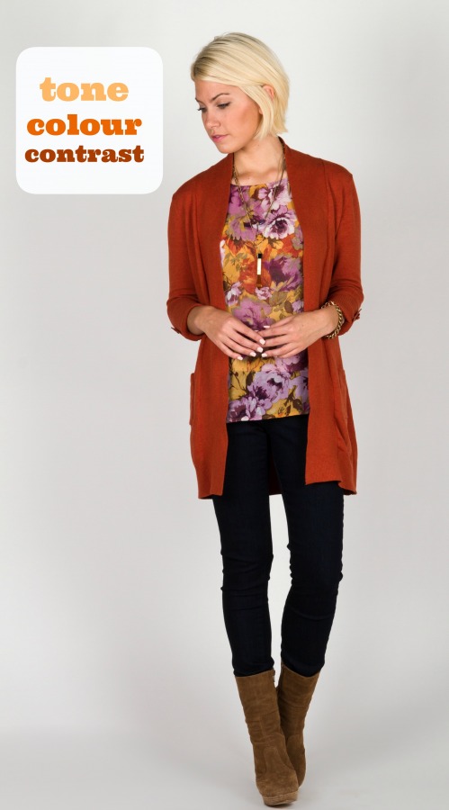
There are three dimensions we look at, including tone, colour, and contrast. What this means is that someone who has a pinkish skin tone will match better with cooler, blue-based colours. Someone who has light, bright colouring will look better in lighter, brighter colours (also known as 'high value' colours). Someone who has very soft colouring, not too intense, will match a softer palette, since really bright hues will overwhelm their delicate colouring. Instead of classifying someone with dark hair and dark eyes as a Winter, we might instead say that they have a cool undertone, can wear both high and low value colours (light and dark) and need intense colours to go with their more intense colouring.
This evolution of colour analysis allows us to have a greater range of colour selection over time and helps us navigate the colour trends year after year. It can also help retailers like us to choose things that suit different colouring, instead of just going with what's trendy. This is one way that we're helping customers dress with purpose!


![]()
Did you miss part 2 in our colour series? Click here to catch up!
